The Protein Chart
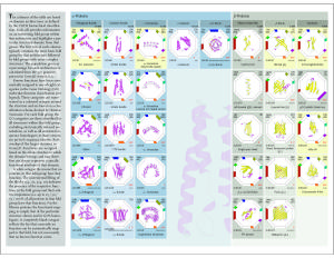
The Protein Chart is designed rather like the periodic table of the elements, but showing representatives of all the domain architectures currently classified in the CATH database. There are over 30 different architectures in CATH which are regular enough for the 2D image of the structure to provide meaningful information. The chart is organised so that the smallest representative for any given architecture is at the top of the chart and the largest at the bottom, giving a good impression of the variation of size and structure that can occur. The chart also gives information on the proportion of genome sequences predicted to adopt a particular architecture, and also the types of functions (using GO term data) exhibited in the different fold groups. There are also illustrations of common supersecondary motifs and oligomeric proteins.
An example page of the chart is shown below:
The Protein Chart is published by Wiley and can be purchased from here
